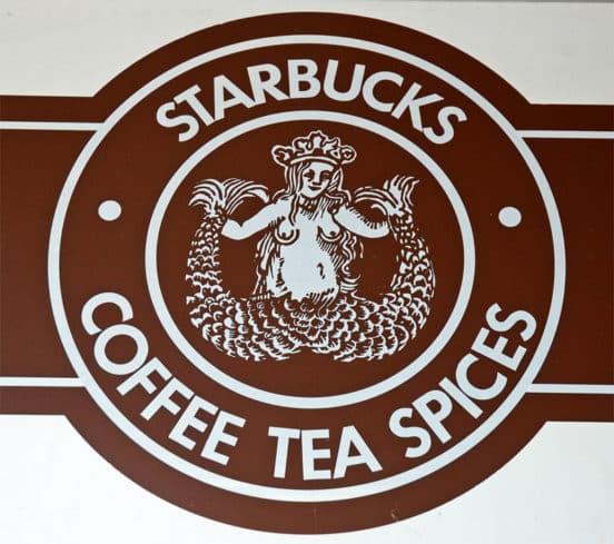
A brand that I am familiar with, that overall has done an excellent job at positioning itself is Starbucks. Starbucks as a brand was invented by Howard Schultz, but in the beginning it was started by Terry Heckler. The chain is named after Starbuck the first mate in the novel Moby Dick. The seafaring theme has been a part of the Starbucks logo since its inception (thedesigninspiration.com). Heckler wanted the logo to be something that reminded him of the maritime history of Seattle and came up with a two-tailed mermaid, encircled by the stores name, (see below pic).

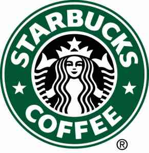
When Starbucks was sold and bought by Schultz, he wanted to create something a bit more contemporary. The brown color was ditched and green was chosen. The mermaid was also tweaked a bit and made to look more modest and modern.

Starbucks attempted to get back to their roots and decided to switch back to a version of their original logo in 2008 but this was rejected by fans and consumers of their favorite coffee shop. They wanted to iconic green and modern mermaid.

The logo you see today when you drive through a Starbucks or step into a cafe for your morning coffee or afternoon pick me up is that of the iconic green and white mermaid but without the Starbucks name.

“This new evolution of the logo … embraces and respects our heritage and at the same time, evolves us to a point where we will feel it’s more suitable for the future. The new interpretation of the logo … gives us the freedom and flexibility to think beyond coffee but make no mistake … we will continue to be the world’s leading purveyor of the highest-quality coffee” (thedesigninspiration.com).
Starbucks knew they had to stick to authenticity, the brand was created in Seattle so in coming up with branding logos keeping with the tradition and history of Seattle was important. When trying to update the brand it is critical to stay in line with what your consumers know and identify with. “If it ain’t broke, don’t fix it.” This saying is exactly what Starbucks needed to keep in mind when they decided to switch back from the iconic green and white mermaid that all consumers identify Starbucks with, so dropping all wordage and just simply keeping the image was a success.
References:
January 3, 2018. The Evolution of the Starbucks Logo. Retrieved from https://thedesigninspiration.com/blog/2018/01/03/the-evolution-of-the-starbucks-logo/ on May 22, 2019.
Gregory, Lawrence. (February 16, 2019). Starbucks Coffee’s Mission and Vision Statement. Retrieved from http://panmore.com/starbucks-coffee-vision-statement-mission-statement on May 22, 2019.